Recently I have been looking into different algorithms for the clustering geospatial data. The problem of finding “similar” regions in space, is a very interesting one, since this type of classification enables a whole range of applications (e.g.: urban development, transport planning, etc).
When we are working with “Big Data”, as the one resultant from streaming of crowd sourced date (for instance), the amount of information makes it difficult to visually detect things; this is often where artificial intelligence can “give us an hand”.

DBSCAN is a density-based clustering algorithm, that can find an, a priori unknown, number of clusters with an arbitrary shape. It starts with a certain “idea” of what a cluster is, based on a density as defined by its parameters: epsilon and minpts. This “idea” is also the main weakness of DBSCAN, as the global parameters, don’t allow to capture different densities in the dataset, if that is the case; and often, in geographical datasets, it is.

In the example above, we can see that a different value of epsilon, and therefore a different threshold of density, yields very different results. With the larger epsilon we detect clusters around all the AOI, but the centre comes up as a single cluster. With the smaller epsilon, we have more detail in the centre, but we “loose” the less dense clusters in the outskirts. In a way, DBSCAN corresponds to looking at the data with “semi closed” eyes, and this is why its results make so much sense to the user.
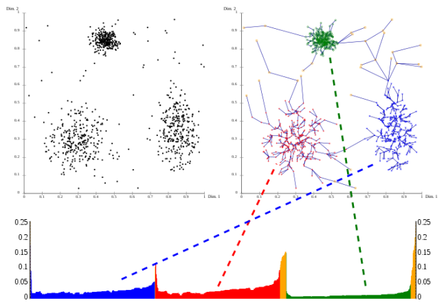
OPTICS is considered a generalization of DBSCAN, tackling exactly these difficulty in configuring the parameters, by becoming almost parameterless. Instead of using an epsilon to limit the search for neighbours, OPTICS considers a range of epsilons, up to a maximum, that could be a radius that includes the entire AOI (although for practical purposes, you don’t really want to do that, because it increases the complexity of the algorithm). OPTICS is essentially an ordering of the database, such as points that are spatially closest become neighbours in the ordering. The output of optics is a graphic plotting this ordering, and a special distance that is stored for each point, representing the density that needs to be accepted for a cluster in order to have both points belong to the same cluster; this is called a dendrogram.
source: wikipedia
OPTICS does not produce a strict partitioning of the data, but this can be done using algorithms, that try to identify the “peaks” and “valleys” in the graphic, or by selecting a range of x and a threshold of y (xi). Generally speaking these algorithms produce a hierarchical clustering, which is more difficult to interpret than the “flat” partitioning produced by DBSCAN. Conceptually, this OPTICS output would correspond to many “runs” of DBSCAN.

There are implementations of DBSCAN and OPTICS in the WEKA and ELKI libraries. WEKA’s implementation of DBSCAN has been thoroughly referred as slow, when compared to ELKI’s implementation. This benchmarking illustrates well the difference between the two. Although some improvements were added in the latest versions of WEKA, this difference was confirmed by invoking the two algorithms in some test cases. OPTICS implementation in WEKA does not produce a classification. In ELKI’s library, the OPTICS algorithm is separated from the classification algorithm, following ELKI’s modular philosophy; ELKI’s OPTICSxi produces a clustering classification, using a partitioning algorithm selected (or implemented) by the user.
DBSCAN is very sensitive to its two parameters, which are quite hard to setup. Also, the parameters “influence” each other in the result. They are hard to setup because they depend largely on the particular phenomena we are studying, and which type of clusters we want to detect. If we want to identify “meaningful” things, we need to have a pretty good idea of what we are looking for. If a good domain knowledge is strongly advised, it is also advised to inspect the results of the clustering algorithm, by plotting them in a map. For all these reasons, I think that DBSCAN is very good as a exploratory tool, for producing meaningful and scientific analysis about a dataset, but I don’t see it as very “realistic” to implement it as part of a “service” that automatically analyses any dataset, “on demand”.
OPTICS seems a bit more “obscure” to me. The algorithm is more sophisticated than DBSCAN, in the sense that it has a more “flexible” idea of a cluster, but it produces a more complex result, which is more difficult for the user to interpret. OPTCIS itself does not produce any classification, so the quality of the cluster “results”, actually heavily depend on the algorithm that we choose to perform the partition.
In a way, I don’t see OPTICS as a “replacement” for DBSCAN, but as a complement. It allows us to detect some “patterns” that are not “visible” to DBSCAN, but the lack of global parameters does not allow us to capture the “global” structure of the dataset.